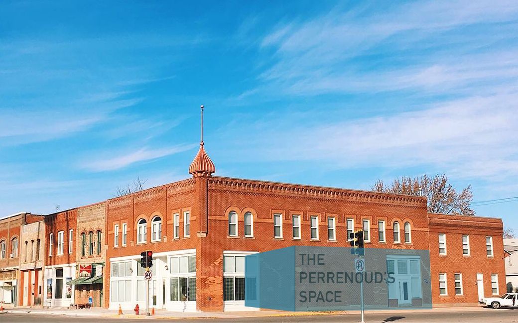
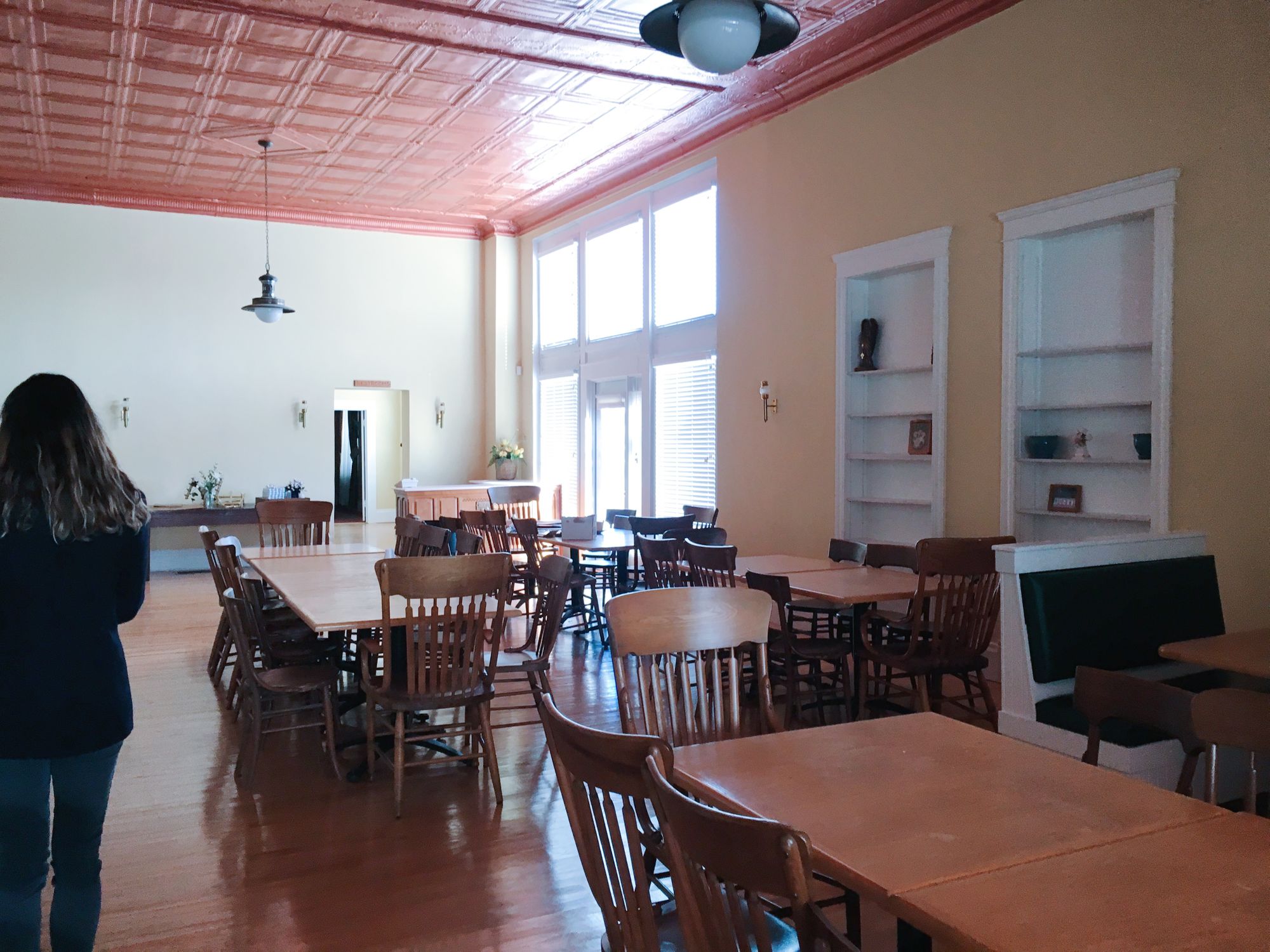
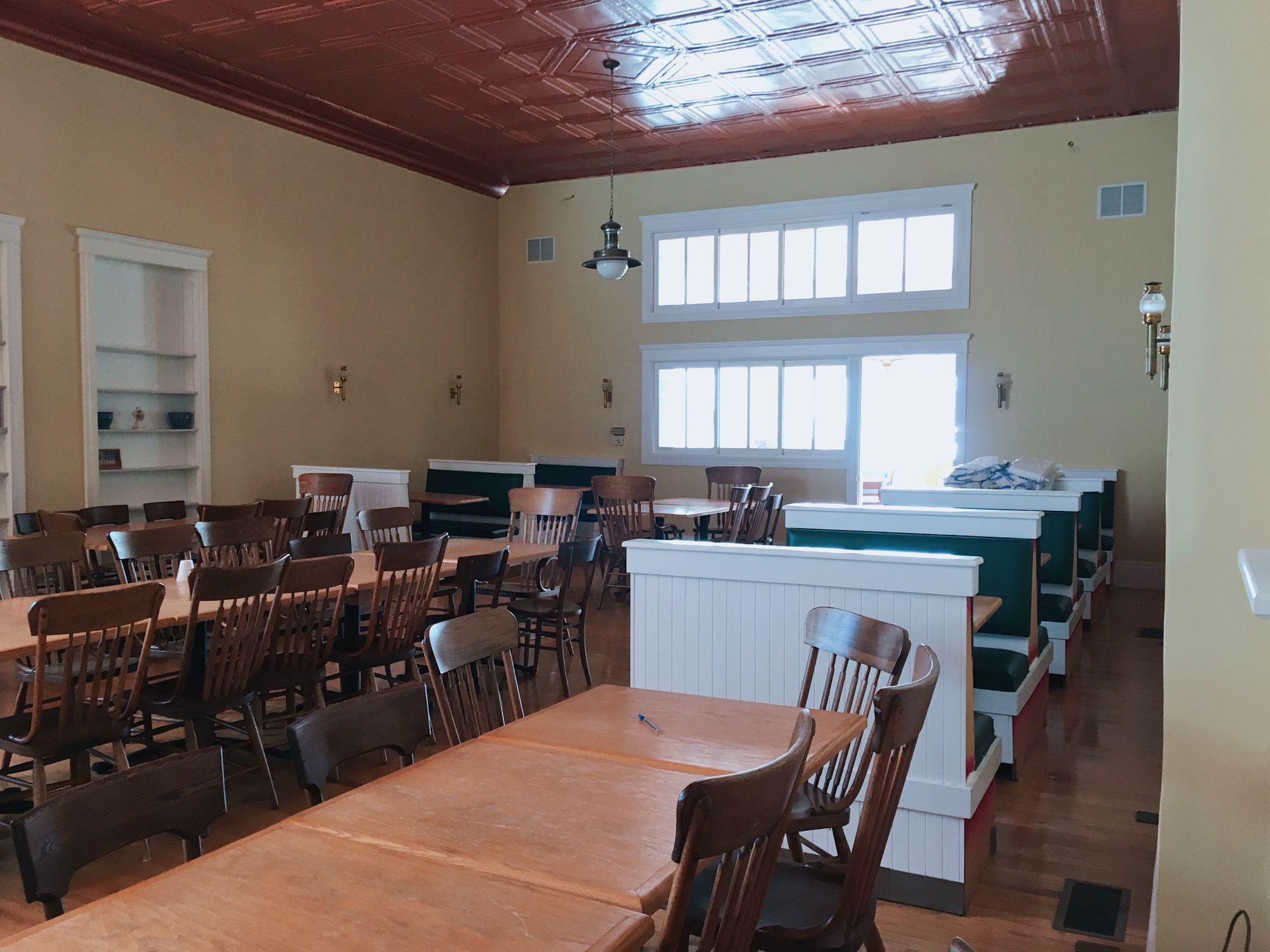
The former dining room we've pegged as the location for our "hotel lobby bar" is a large, rectangular room, roughly 24' wide by 42' long, with no fixed furniture—essentially a wide open space, ripe for reconfiguring to our specific needs.
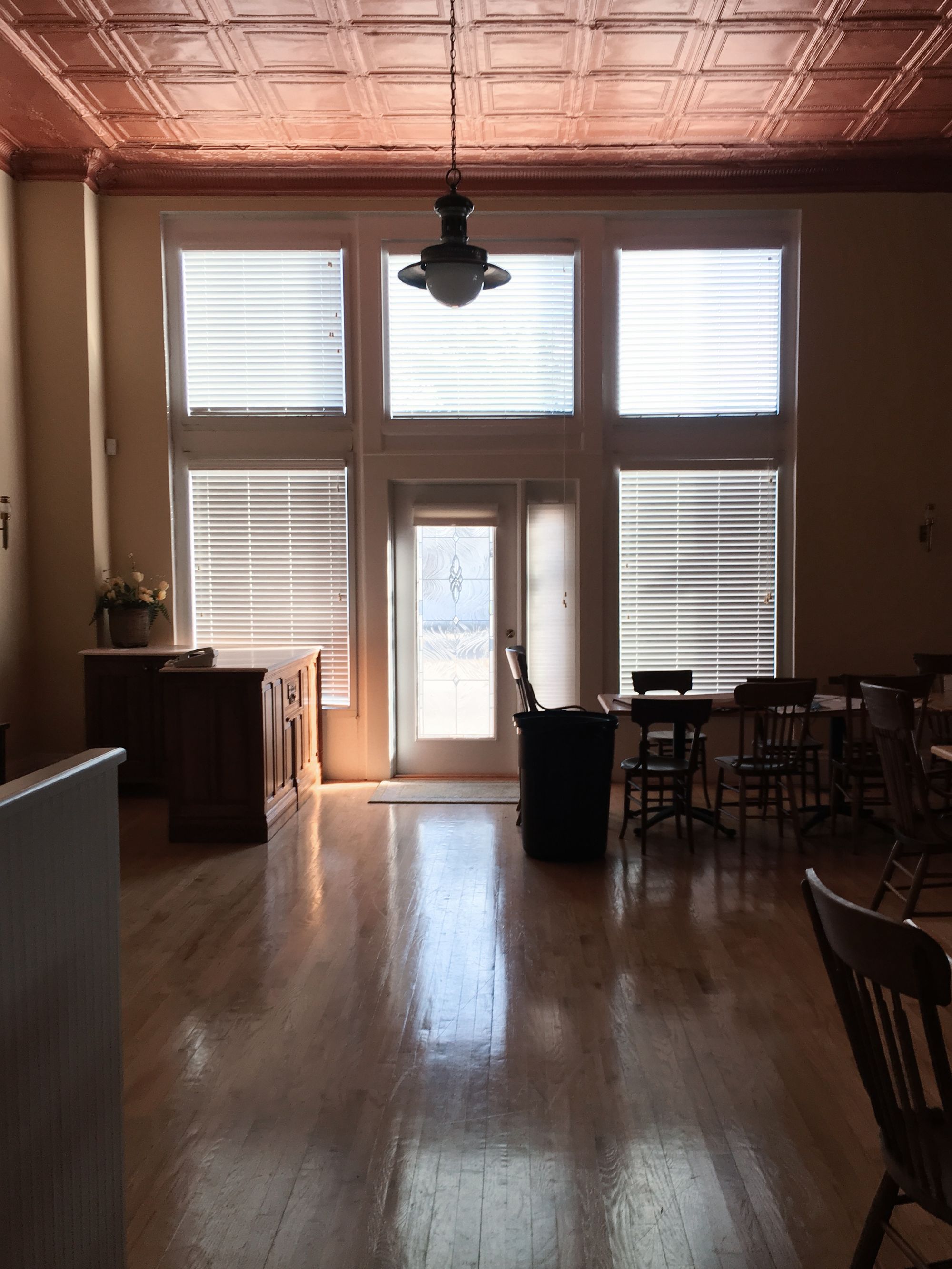
It's an elegant space, renovated in the mid-90s as a nice restaurant, so the bones of the space are good. The original tin ceiling is intact, 14-feet high, and painted a beautiful, metallic copper that ought to bring a lot of life to the Perrenoud's brand: the jewels' precious metal partner. There are only two ceiling light fixtures, each a large globe pendant that feel historical, and vaguely southern; neither will provide the kind of lighting we'll need, so they'll be replaced.
The walls are painted a pale yellow, with white trim, both too bright for our "dark & moody" lounge. We'll repaint. There are lots of obstructions along the walls that may make shaping the space more difficult—lighting, doorways, windows, built-ins, etc. The dozen-or-so regularly-spaced wall sconces, lovely brass and glass lanterns that sort of remind me of train torches, will stay; I love them.
The floors are a modern addition: solid oak, finished in a bright, natural gloss, and showing lots of wear that may require refinishing.
Let's orient ourselves within this room, looking at each wall in turn:
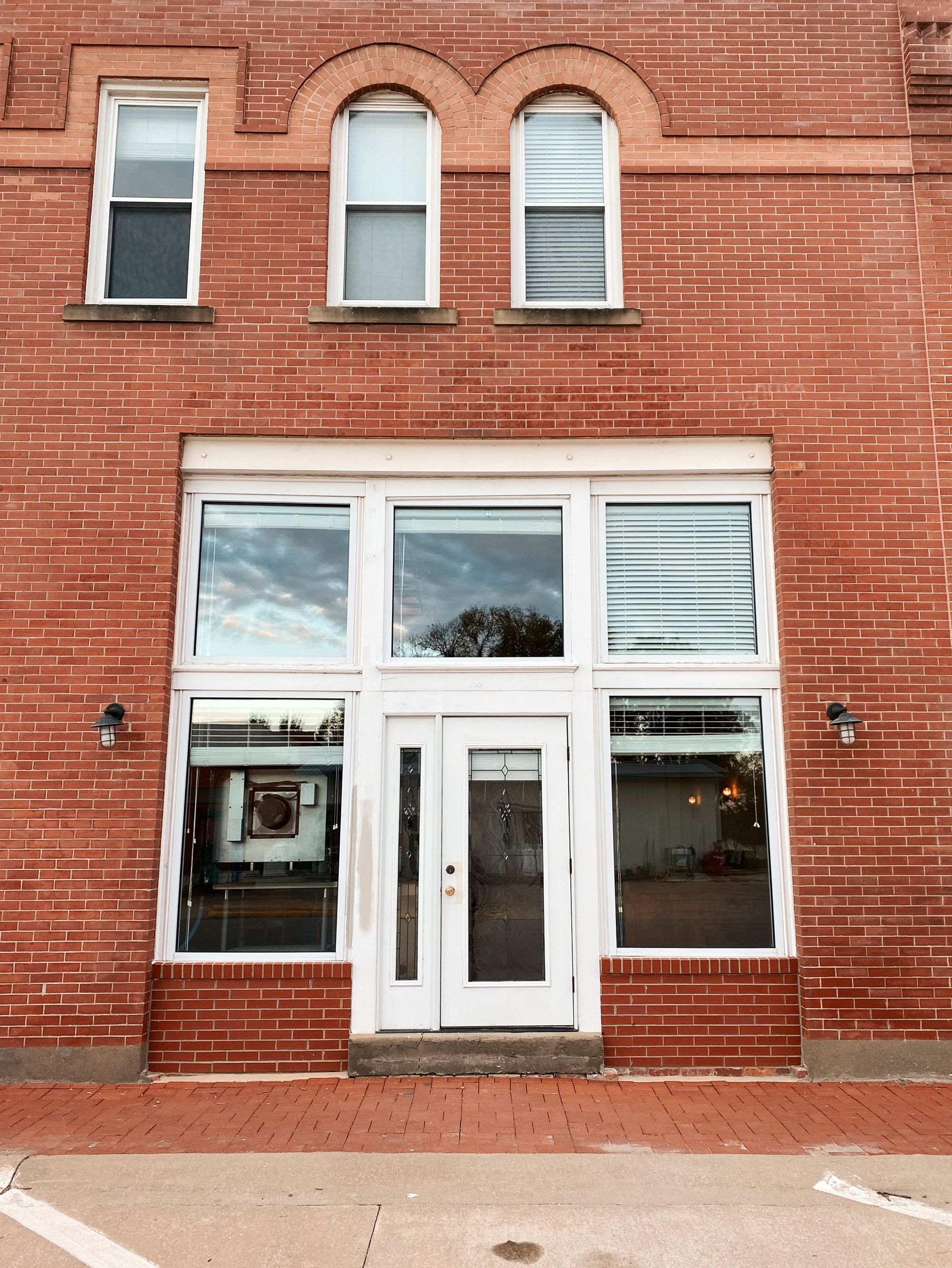
The room's eastern and only exterior wall borders Humboldt's busiest street: the old highway, now 9th Street. It contains a large entryway at its north end that, despite facing a heavily-traveled road and featuring large storefront windows, definitely feels like a side door. (Renovating this entrance to possess its own gravitas and curb appeal will be its own project, when time and inspiration allows.) This long wall also includes two built-in bookcases, set into the framing of an old doorway and window, both of which have long been bricked-in from the outside.
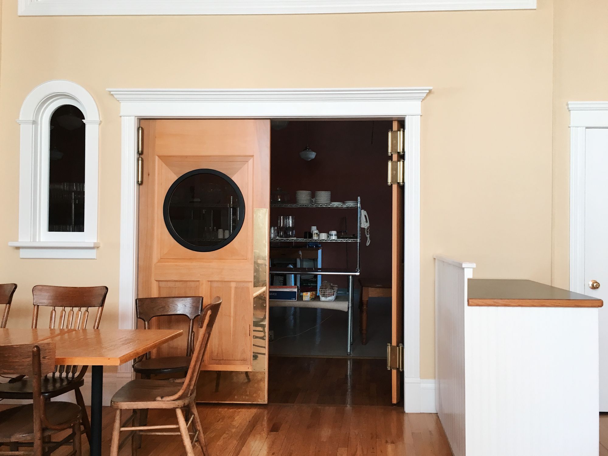
Across the room from the entrance, on the long western wall, is the access to the commercial kitchen, comprised of double-action swinging doors, a large transom window, a tiny arched window, and a utility closet. There are some beautiful details here, but also just so much going on—in particular the huge double doors with round porthole windows that scream "kitchen"—that we'll need to scale this back if we're to create an intimate bar atmosphere in this room.
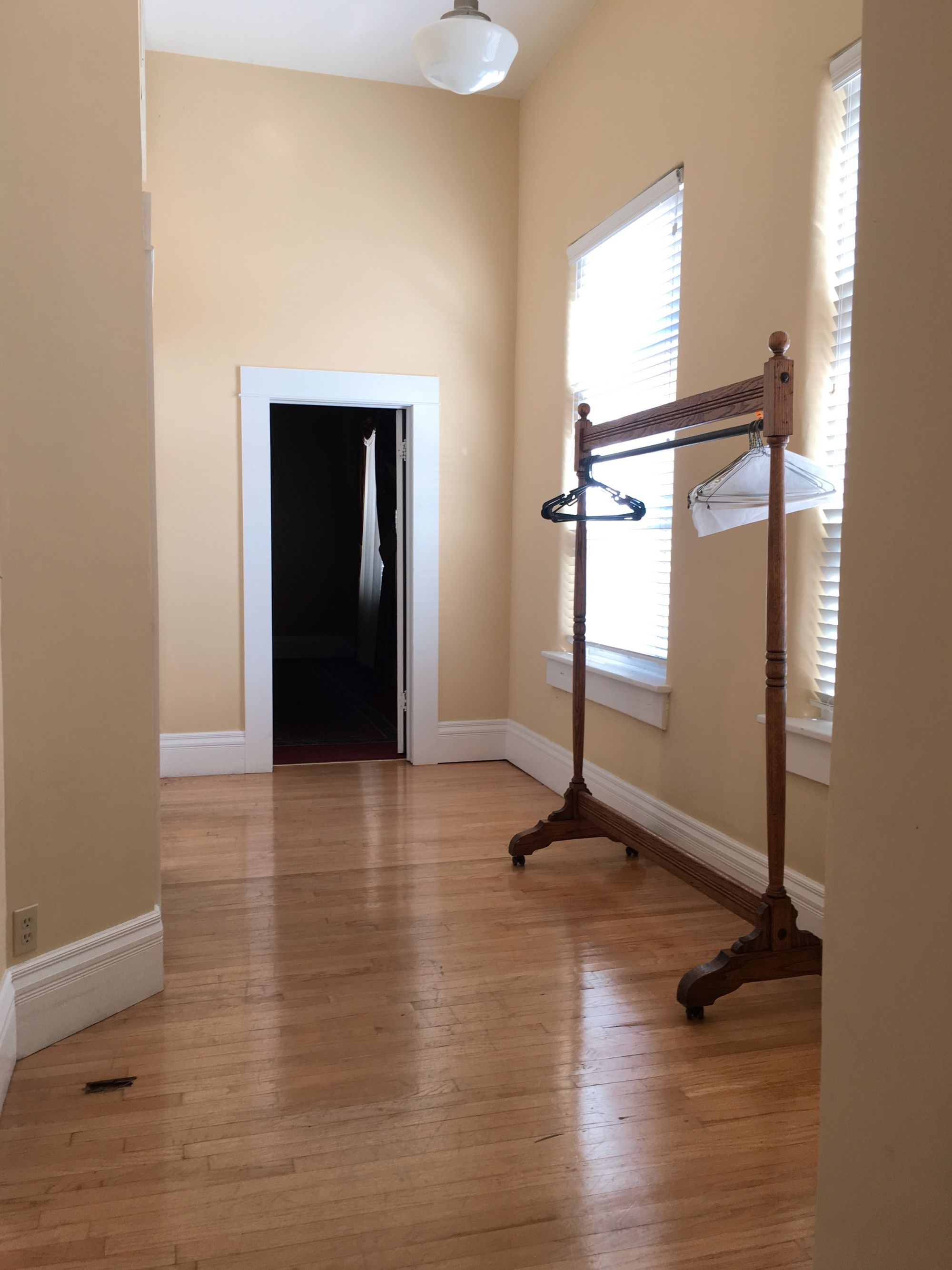
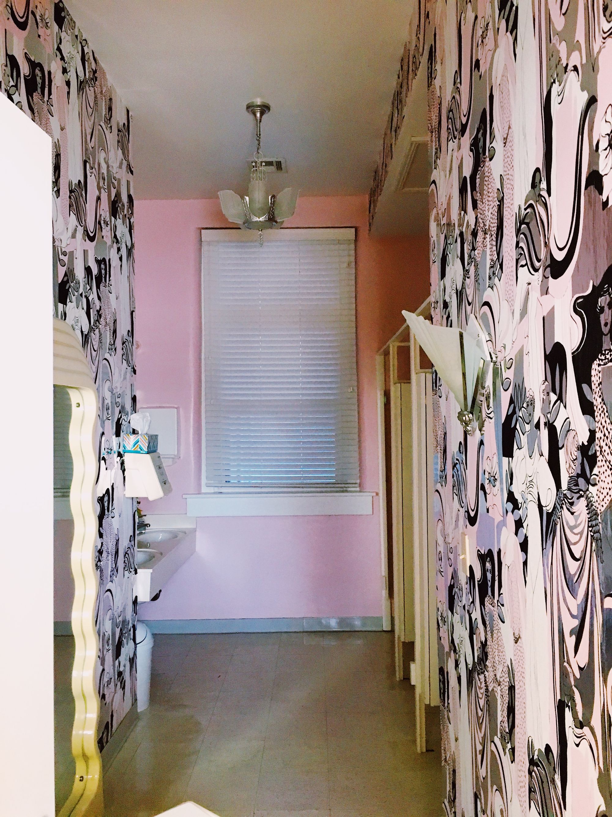
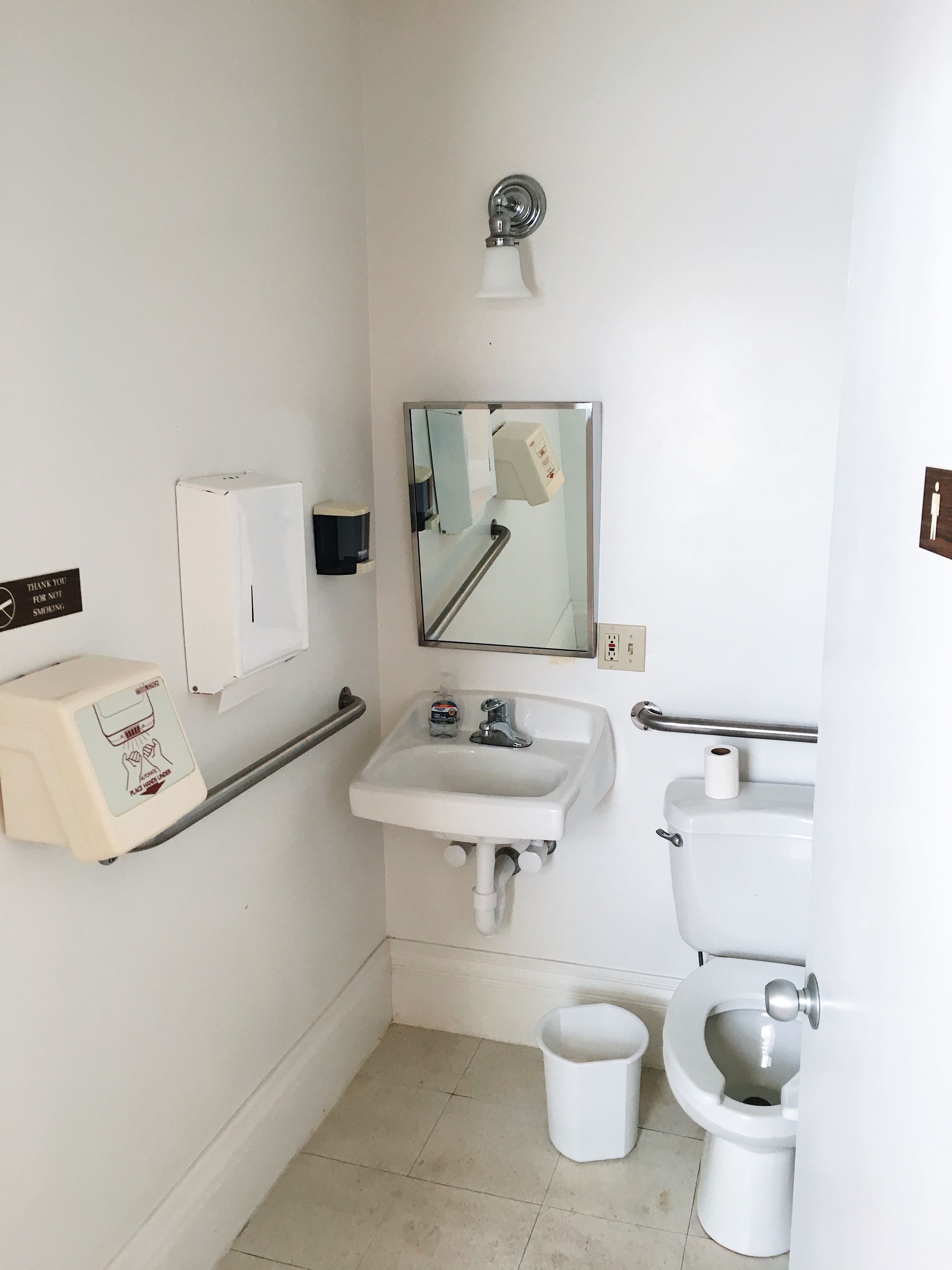
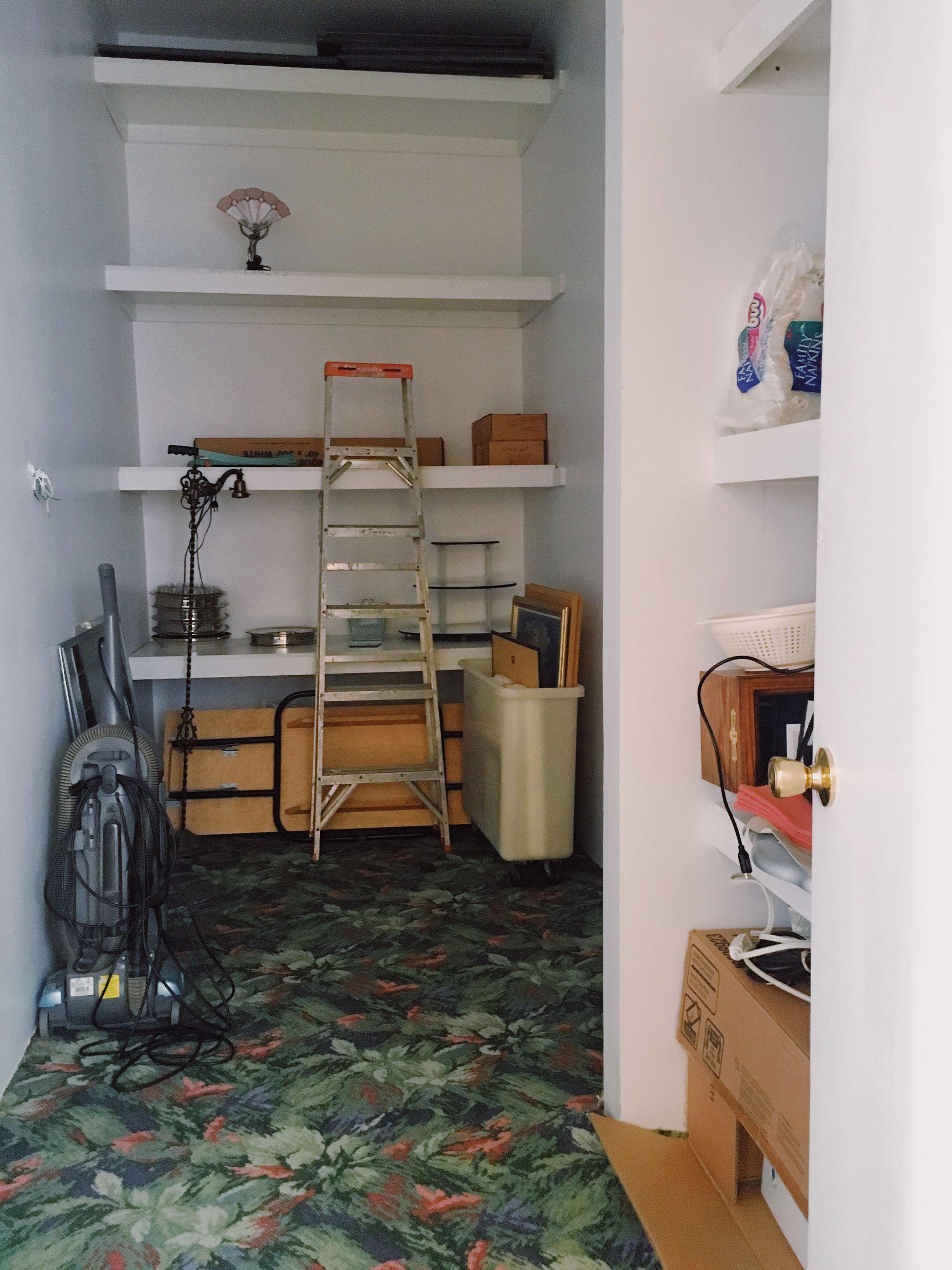
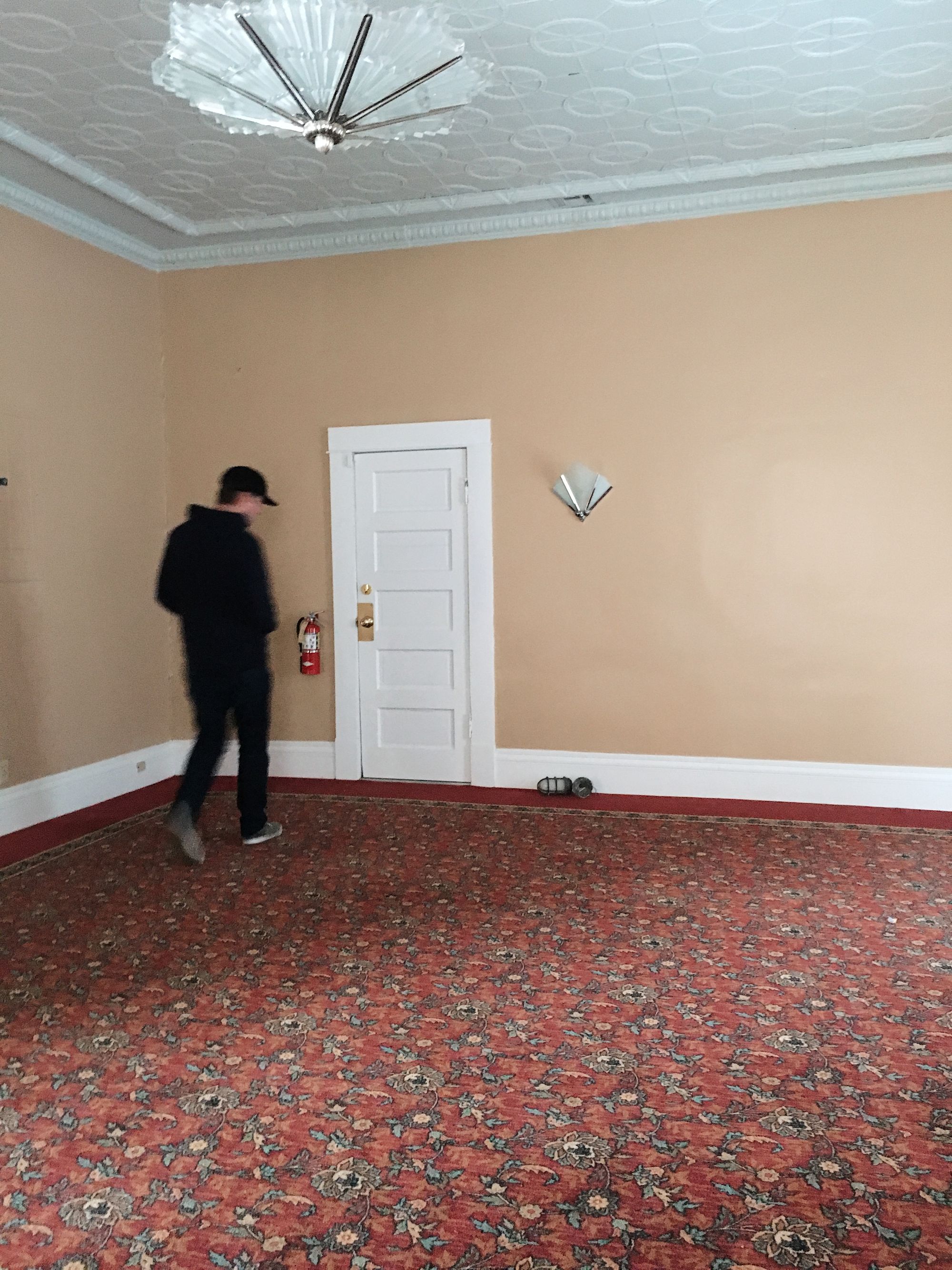
The north wall has only a small opening that leads to a short hallway, serving four additional rooms: 1) a large storage closet; 2) an over-the-top art deco women's bathroom; 3) a small accessible/men's bathroom; and 4) a large office (currently being used as the A Bolder Humboldt headquarters). Building out a proper men's room, as well as updating the women's room, will be a major sub-project. We will not get to overlook this small, but dense hallway.
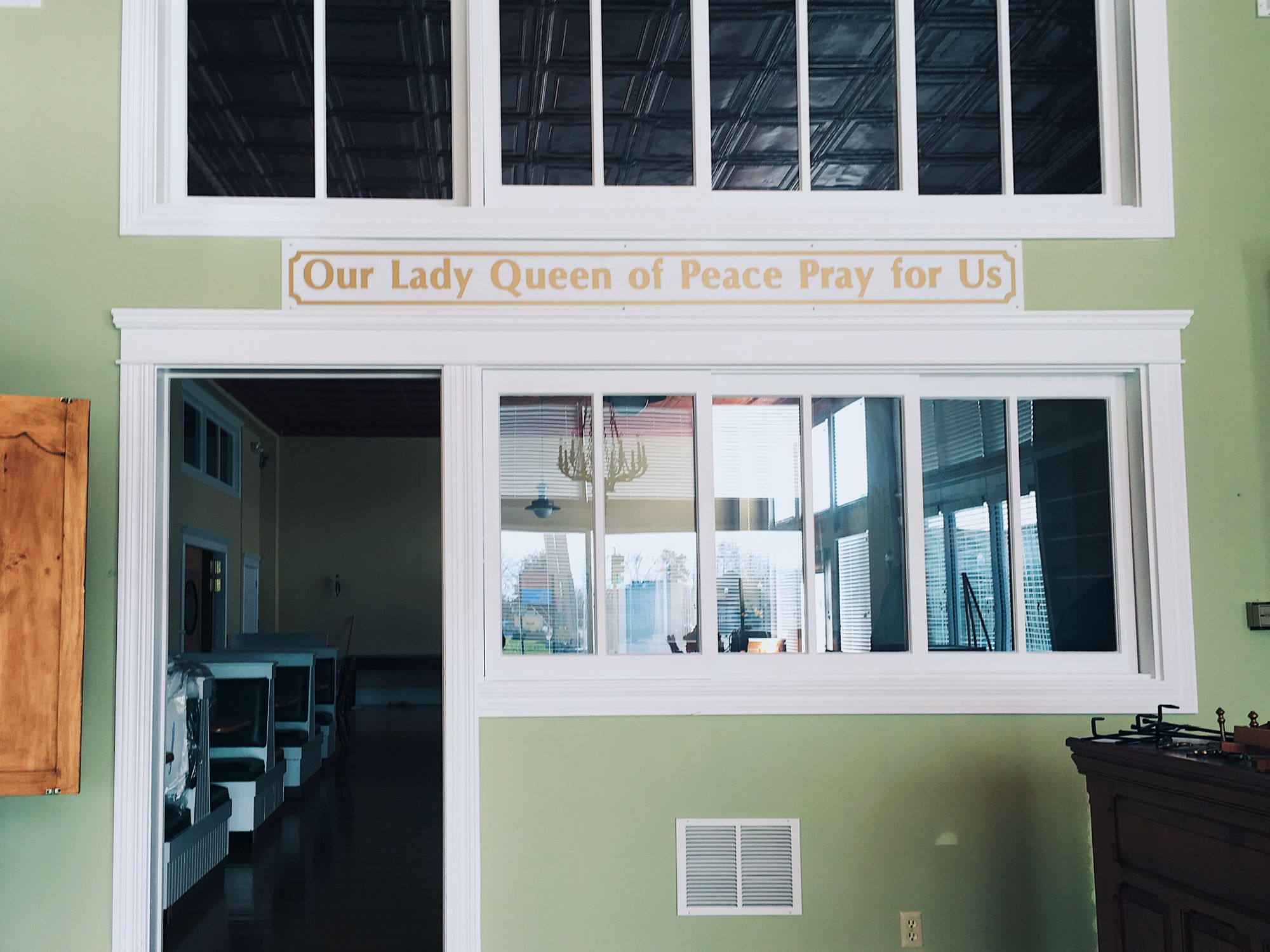
The south wall of our future barroom divides what otherwise might be one large room into two. This wall is dominated by two sets of large windows and a door that look onto the front-corner storeroom of the Bailey, and provide a modest, but necessary amount of natural lighting. This corner room is prime real estate for Humboldt, occupying the busiest corner in town, and one of its most visible storefronts. The room itself is about half the size of the cocktail bar, yet begs to be used for some valuable purpose. But what? Regardless of its eventual purpose, the doorway on this south wall will likely be a high traffic spot, serving as the only access, via the bar, to the ground-floor's only bathrooms.
Now that we understand the blank-ish canvas we have to work with, and the assets and obstacles it provides, we can begin to shape the space with purpose for our project's specific needs.
